BACKGROUND
Toronto Public Library is the largest library system in the world. They approached me to lead the research, ideation, and development of the new brand identity for the Toronto Public Library.
Toronto Public Library is the largest library system in the world. They approached me to lead the research, ideation, and development of the new brand identity for the Toronto Public Library.
OBJECTIVE
To separate from the competition amongst the libraries across the nation. To invigorate the younger generation to come in and explore all 100 facilities that the Library has to offer. This brand identity had to be new, exciting, and bold while maintaining a sense of simplicity.
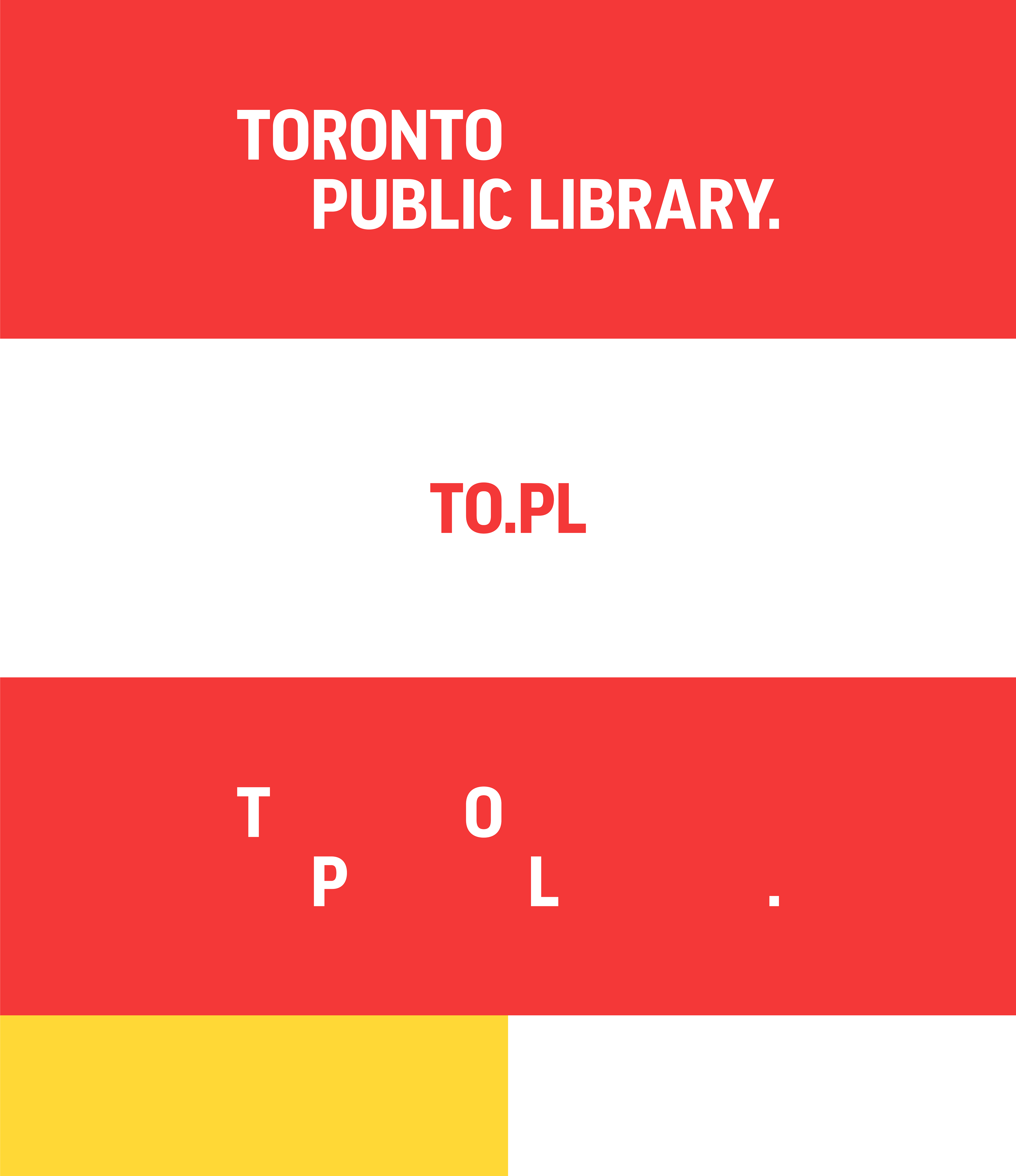
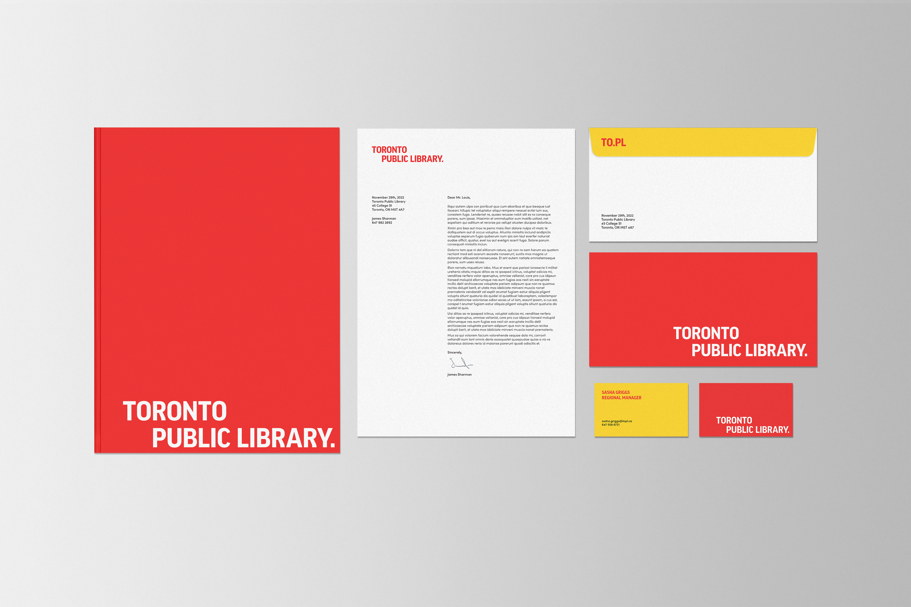
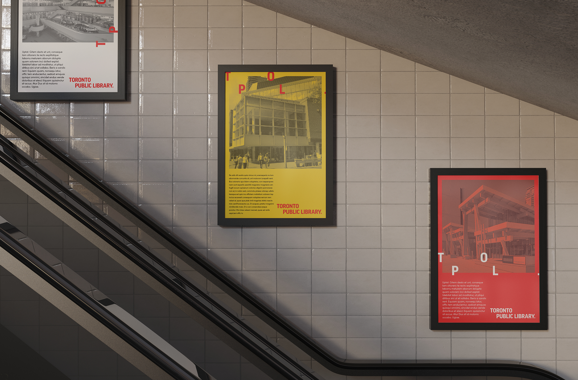
OUTCOME
A brand identity that celebrates the city, and all the unique personalities within it. The logo emboldens the city of Toronto. White space plays a vital role, opening up the logo and allowing the Torontonian in, easily distinguishing what the service is all about. ‘TO’ and ‘Library’ placed, respectively, above and below the white space.